Nokia has revealed its new logo: it’s designed to get rid of the “smartphone manufacturer” stamp
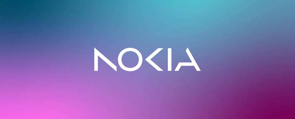
Nokia designed a new logo to break the brand’s association with smartphones. On the 26th of February, before the Worldwide mobile congress in Barcelona, the company revealed its new logo without its iconic font and blue color.
“ We are updating our strategy, and, as a key enabler, we are also refreshing our brand to reflect who we are today”, – says the general director of Nokia, Pekka Lundmark. Besides the fact that the company is well-known as mobile phones manufacturer, it is now working with network communications technologies.
“Most people think we are still a successful mobile phones manufacturer, but Nokia is no more about mobile phones, – says Pekka Lundmark to Bloomberg – We want to launch a new brand that focuses on networks and industrial digitalization, which is a completely different thing than legacy mobile phones.”
Some facts about Nokia:
- Microsoft bought Nokia’s mobile phones business for $7 billion in 2014
- In 2016, HMD Global, a company made up of former Nokia executives, acquired the rights to use the Nokia brand for smartphones and tablets.
- In February, HMD Global announced the new G22 smartphone with the classic Nokia logo.
Related Posts